
Inside The Design Codes Of The World's Most Iconic Watches
 8 min read

Spend enough time around watches and something curious happens. You stop looking at logos. Instead, you begin to recognise watches by instinct. The edge of a bezel, the way a case sits on the wrist, the flow of a bracelet into steel. You don’t need confirmation. You just know. What you’re seeing are design codes. The quiet, deliberate decisions that turn a watch into an icon.
Cartier’s Culture Of Design
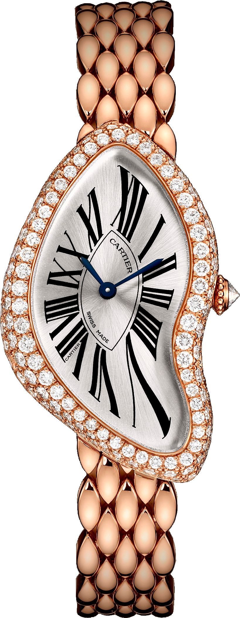
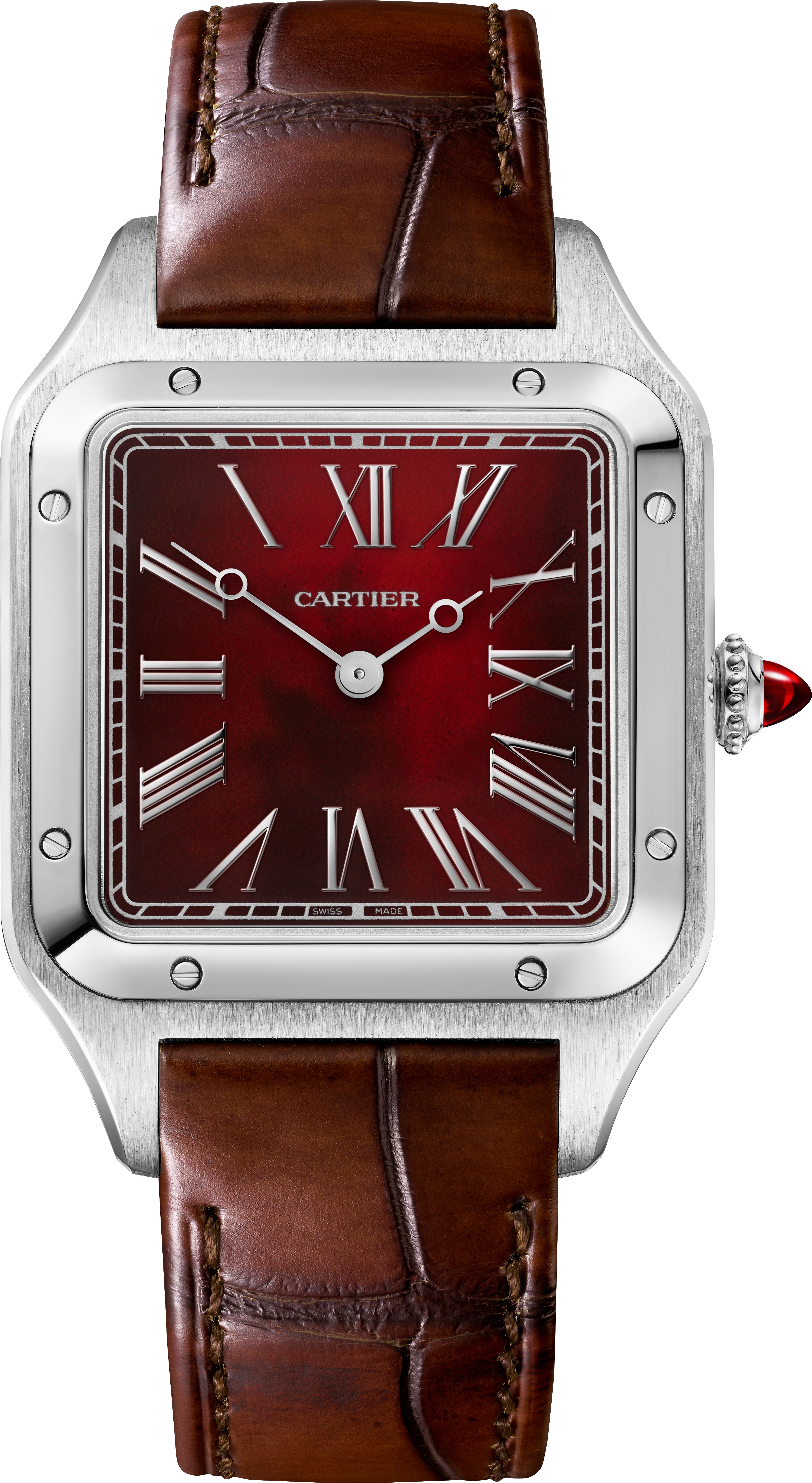
For Cartier, it all starts with the design. An uncompromising feature of the Maison is the use of line. Clean and precise, this radical design concept implemented by Cartier has turned into its signature. The Tank, Santos, Panthère or Ballon Bleu: instantly recognisable, these watches are based on four main principles of creation: the purity of the line, the accuracy of the shape, the precision of proportions, the precious details. The intelligence of their design places them seamlessly within their time as well as securing their future. They can all be reinvented and continue to inspire conversations: a boundless source of creative energy which Cartier dares to develop over time.
"Rail-tracks", cabochon sapphire, Roman numerals… Found on watches designed by the Maison since its creation, the aesthetic codes of Cartier watchmaking are still present in Cartier's watchmaking repertoire. Their unmistakable style and graphic identity make them timeless.
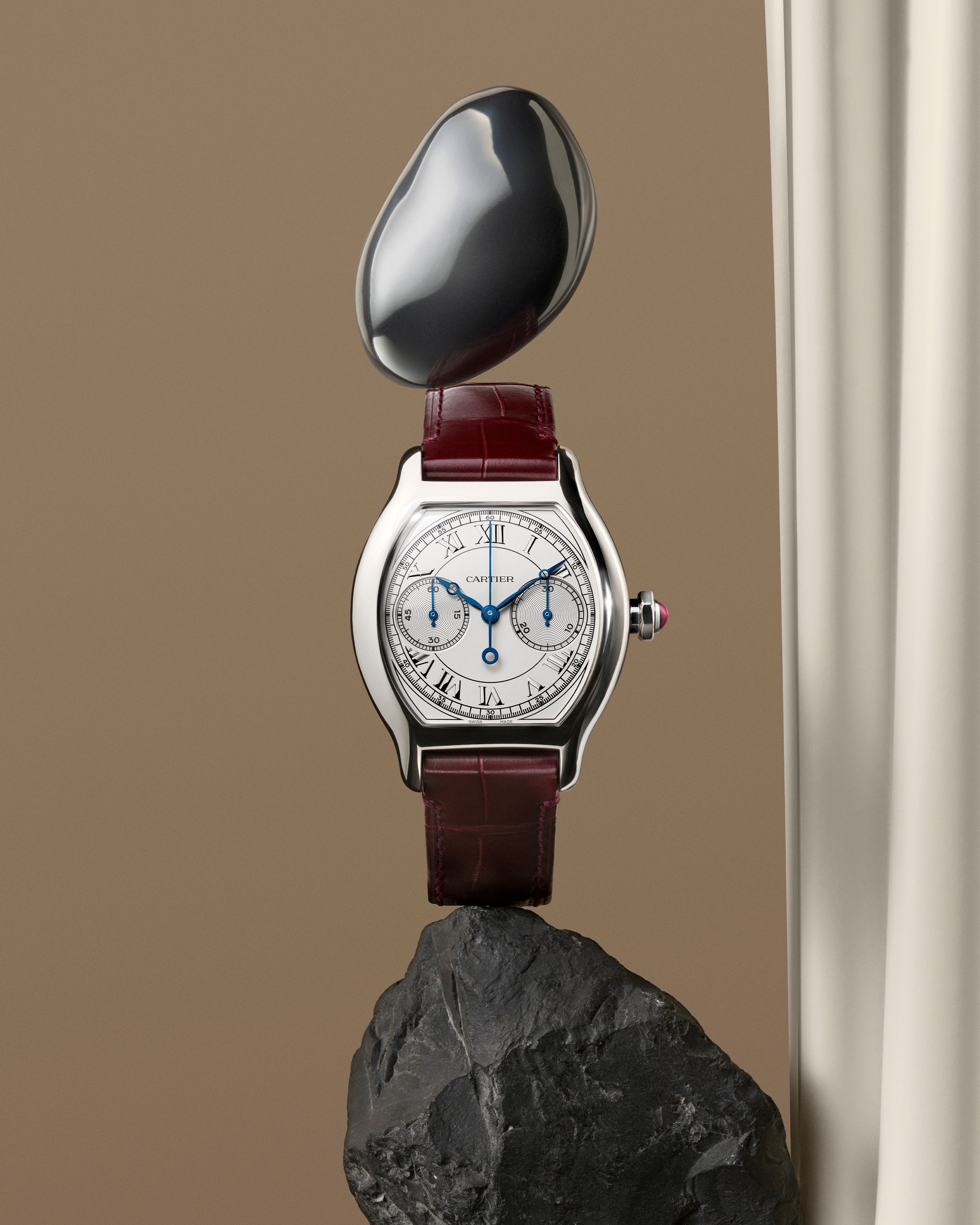
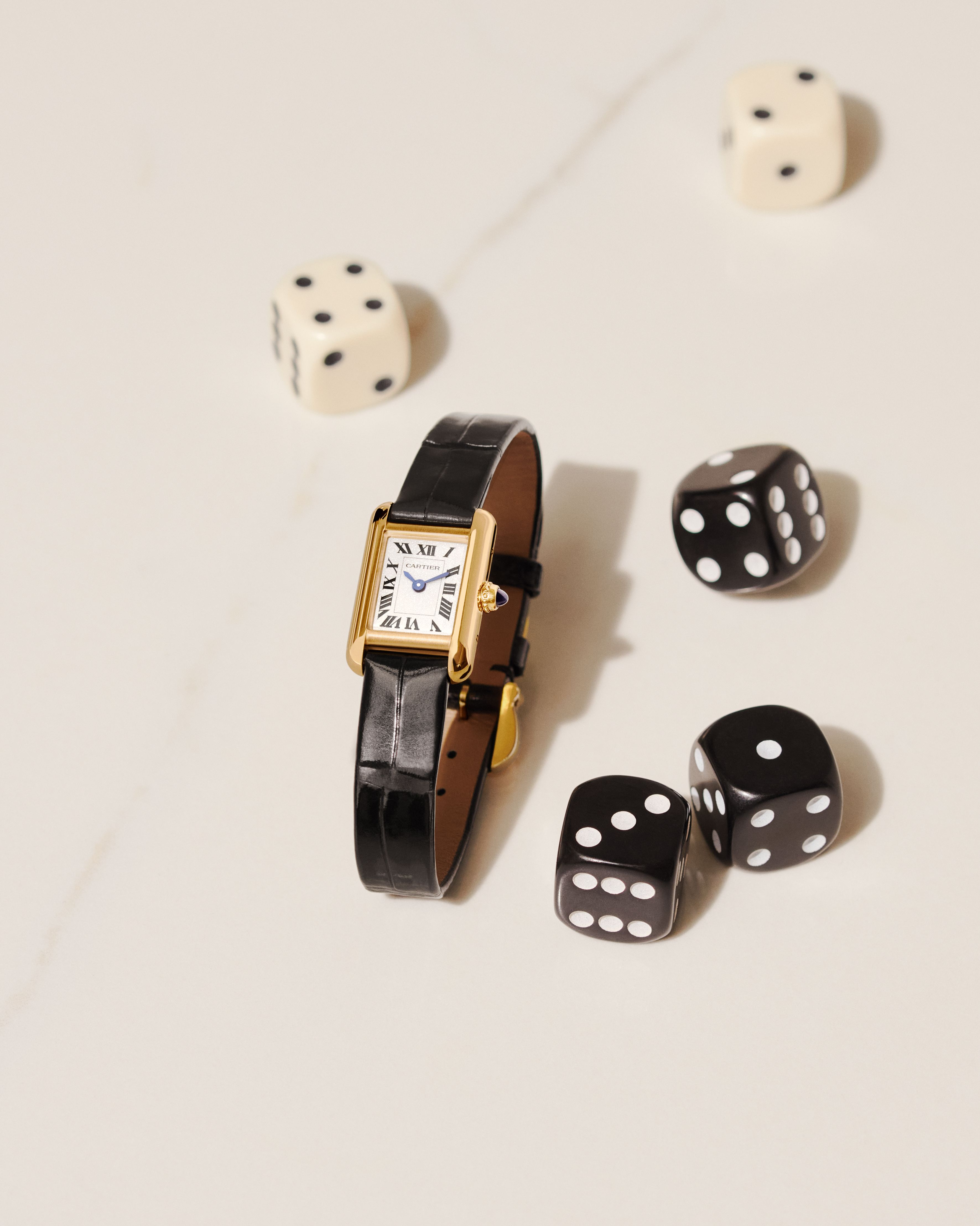
Roman Numerals: Black, graphic and sloping, the Roman numerals on the case radiate out from the central axis, reinforcing the purity of the line present on Cartier watches.
Secret Signature: The Cartier signature is subtly placed at an angle in one of the Roman numerals on the dial.
Rail-Track: The dials feature a "rail-track": a double line with a minute scale. Its design resembles the tracks of a railway line. Louis Cartier is to thank for this highly unique design.
Blued Sword Shaped Hands: The blue hands are the product of a watchmaking tradition found in the Swiss mountains. It’s here, whilst seeking to find a way to prevent watch hands (which at that time were not water resistant) from corroding under the tough climate conditions, where the watchmakers invented the process of bluing. This expertise has since been preserved and carried out by Cartier in a unique way: the hands are placed in kilns that are heated to over 300° for a duration of time which is calculated down to the second in order to obtain the iconic blue colour of the Cartier hands.
Producing these hands requires over 20 different procedures and over 10 different techniques such as hammering, cutting and polishing. Each second, minute and hour hand is selected and paired so that the hands placed on each watch are the exact same blue colour.
Dial: Engraved on the dial, the Cartier guilloché decorates the watches. This decorative technique first appeared in the history of Cartier jewellery at the start of the 20th century. It consists of engraving fine lines on the plate of the dial to form different motifs such as waves or sunrays.
Audemars Piguet’s Achitectural Poetry
In contrast, the Audemars Piguet Royal Oak redefined the language of masculine watch design through its bold octagonal bezel and exposed screws. Industrial in spirit and architectural in form, it was unapologetically modern at launch. Yet today, it stands as confidently within the canon as any classical design.
Octagonal Bezel: Commenting on the design codes for the Royal Oak, Designer Gerald Genta says, “All that was already laid out on the first sketch! The octagonal shape was obviously due to the fitting of the eight screws, because I had to find the space in the bezel to place them all. It is essential to point out that this new seal was an extremely substantial lip-type seal, located between the bezel and the monocoque (monohull) case. The screws were hexagonal because the screw heads were embedded in the bezel, so that they would not turn when locking from beneath. I had to come up with all that in one night! It was a crazy thing, personally I don’t know by what magic it was possible to create such a thing in one night, it was quite amazing!”


Tapisserie Dials: The Tapisserie dial which is now one of the most defining codes of the Royal Oak owes its existence to an unlikely chain of events. As recounted by Helmut Crott in The Dial: The Face of the Wristwatch in the 20th Century (2020), it began in the early 1970s when a Geneva firm, La Nationale, lost the only craftsman capable of operating its ageing guilloché copying machines. Used to create intricate patterns on objects like lighters and cigarette cases, these machines were on the verge of obsolescence.
Rather than discard them, La Nationale passed them on to neighbouring dial-maker Stern Frères who was at that time one of the most prestigious manufacturers in the industry on the condition that an existing order be fulfilled. Under the direction of Roland Tille, Stern recognised the creative potential of these tools despite their complexity. When Gérald Genta arrived to discuss what would become the Royal Oak, Tille presented him with the machines and their 300 design templates. Together, they shortlisted 13 patterns, including one labelled T21 which is the now iconic “Tapisserie 21.”
That design was ultimately chosen. Today known as the Petite Tapisserie, it features a grid of tiny truncated pyramids, punctuated by thousands of diamond-shaped hollows that create its signature play of light. Commenting on his iconic design Genta says “I designed the integrated bracelet which was unprecedented, with tapering intermediate links that made it extremely hard to produce; the dial with hands and hour-markers delicately inlaid with luminous material; the sunburst cobalt blue dial base adorned with Clous de Paris guilloché pattern, complete with a smoky effect as the shade would otherwise have been slightly commonplace.”
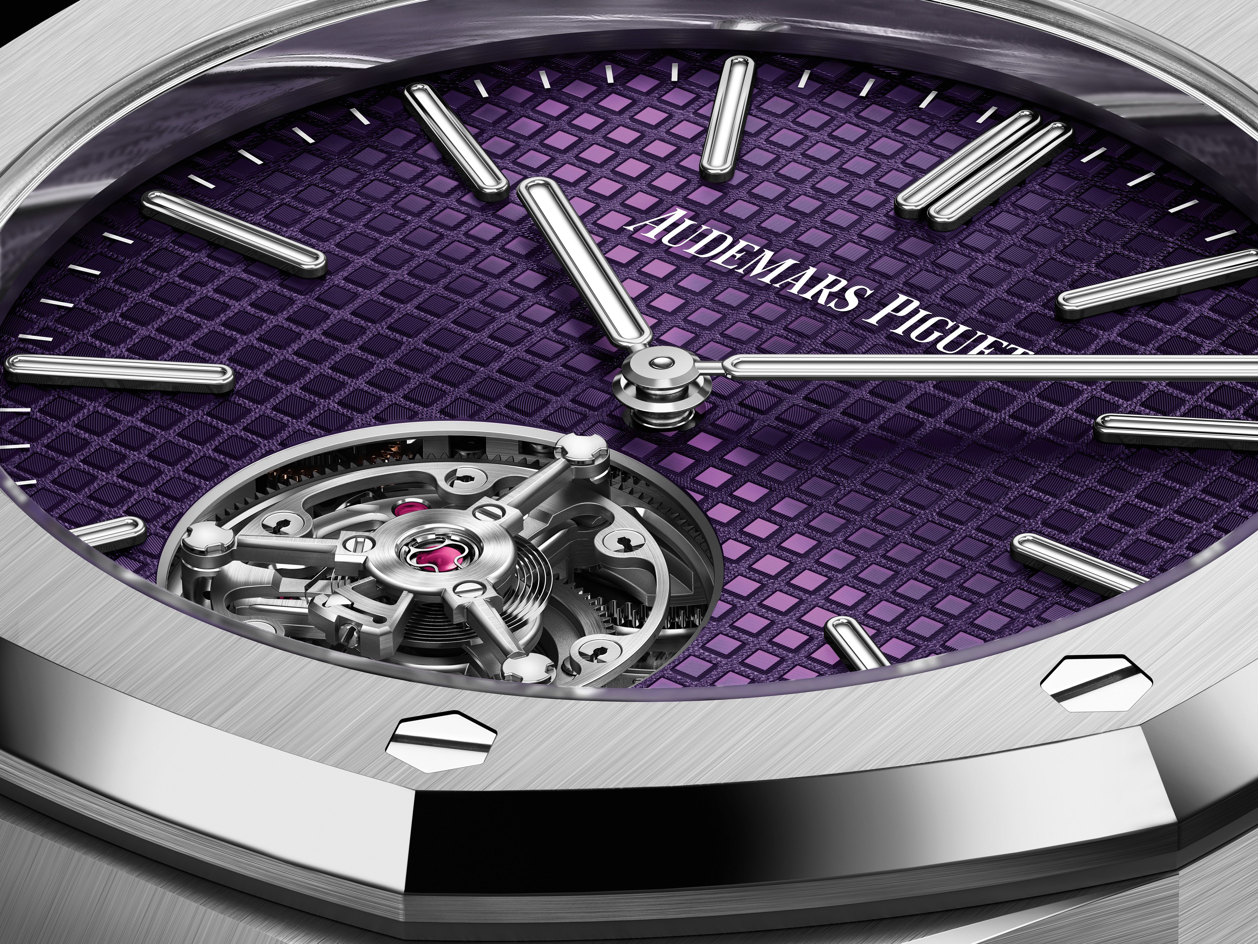
The aesthetics designed by Genta have been constantly reinterpreted since 1976, giving rise not only to a rich and lively collection, but also to two additional collections, each with its own strong identity: the Royal Oak Offshore from 1993 and the Royal Oak Concept from 2002. In 2022, the Royal Oak alone accounts for more than 550 different models, most of which have been produced in multiple variants. If we add the two related collections, this figure amounts to almost 850 models!
Rolex: Engineering as Identity
Few names in watchmaking command instant recognition quite like Rolex. Over decades, the brand has distilled a set of unmistakable design codes. From its signature bracelets to the fluted bezel and Cyclops lens these codes have come to define not just its watches, but the very idea of timeless luxury. These are not fleeting stylistic choices, but enduring elements that continue to shape the identity of Rolex across generations.
At Rolex, the bracelet is not an accessory, it is integral to the watch’s character. Ergonomics, durability and aesthetics are studied with equal intensity, ensuring that comfort and performance are as refined as the design itself. Every bracelet undergoes advanced development and stringent testing, from robotic wear simulations to accelerated ageing in abrasive environments. Even after assembly, each piece is individually inspected by hand to guarantee both strength and finish.
The Bracelet Codes
Over decades, Rolex has built a distinctive bracelet vocabulary:
Oyster Bracelet (late 1930s): A robust three-link design known for its broad, slightly curved links. It remains the most versatile bracelet in the Oyster Perpetual collection and is fitted with either an Oysterclasp or Oysterlock clasp, depending on the model.
Jubilee Bracelet (1945): Created for the Datejust, this five-link bracelet offers enhanced suppleness and comfort. Its polished centre links and satin-finished outer links give it a dressier character.

President Bracelet (1956): Reserved for the Day-Date and select precious metal models, this semi-circular three-link bracelet is crafted only in gold or platinum and remains one of Rolex’s most exclusive signatures.
Oysterflex (2015): A patented hybrid combining flexible metal blades overmoulded with high-performance black elastomer. It delivers the strength of metal with the comfort of a strap and is reserved for select gold models.
The Cyclops Lens: Function Becomes Signature
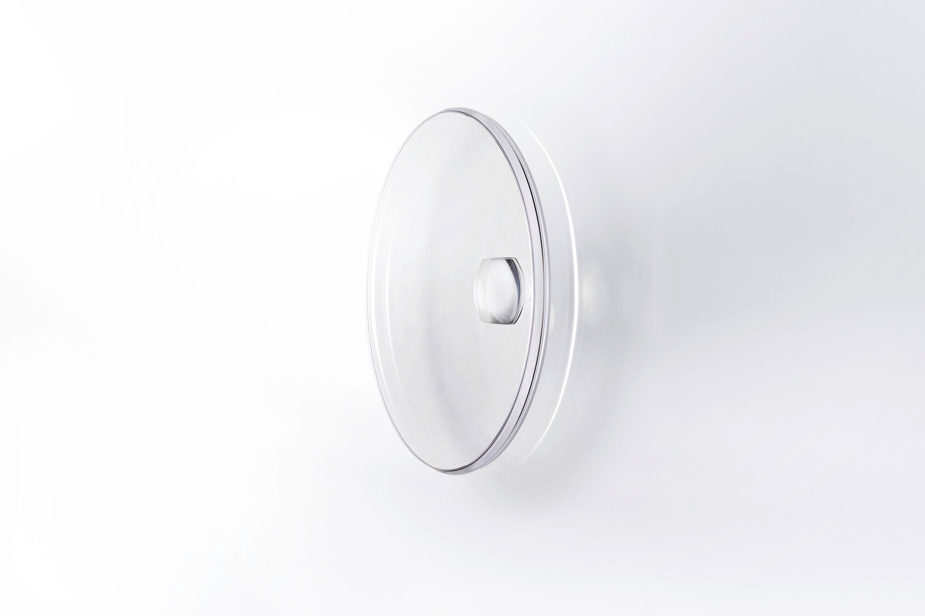
Introduced in 1953 on the Datejust, the Cyclops lens magnifies the date for improved legibility. Originally crafted in Plexiglas as a single piece with the crystal, it evolved in the 1970s with the introduction of scratch-resistant sapphire. Today, the sapphire Cyclops lens is affixed to the crystal and treated with a double anti-reflective coating. Beyond its practicality, the domed magnifier has become one of Rolex’s most recognisable visual cues a functional innovation that evolved into an aesthetic hallmark across most date-equipped Oyster Perpetual models.
The Fluted Bezel: From Utility to Icon
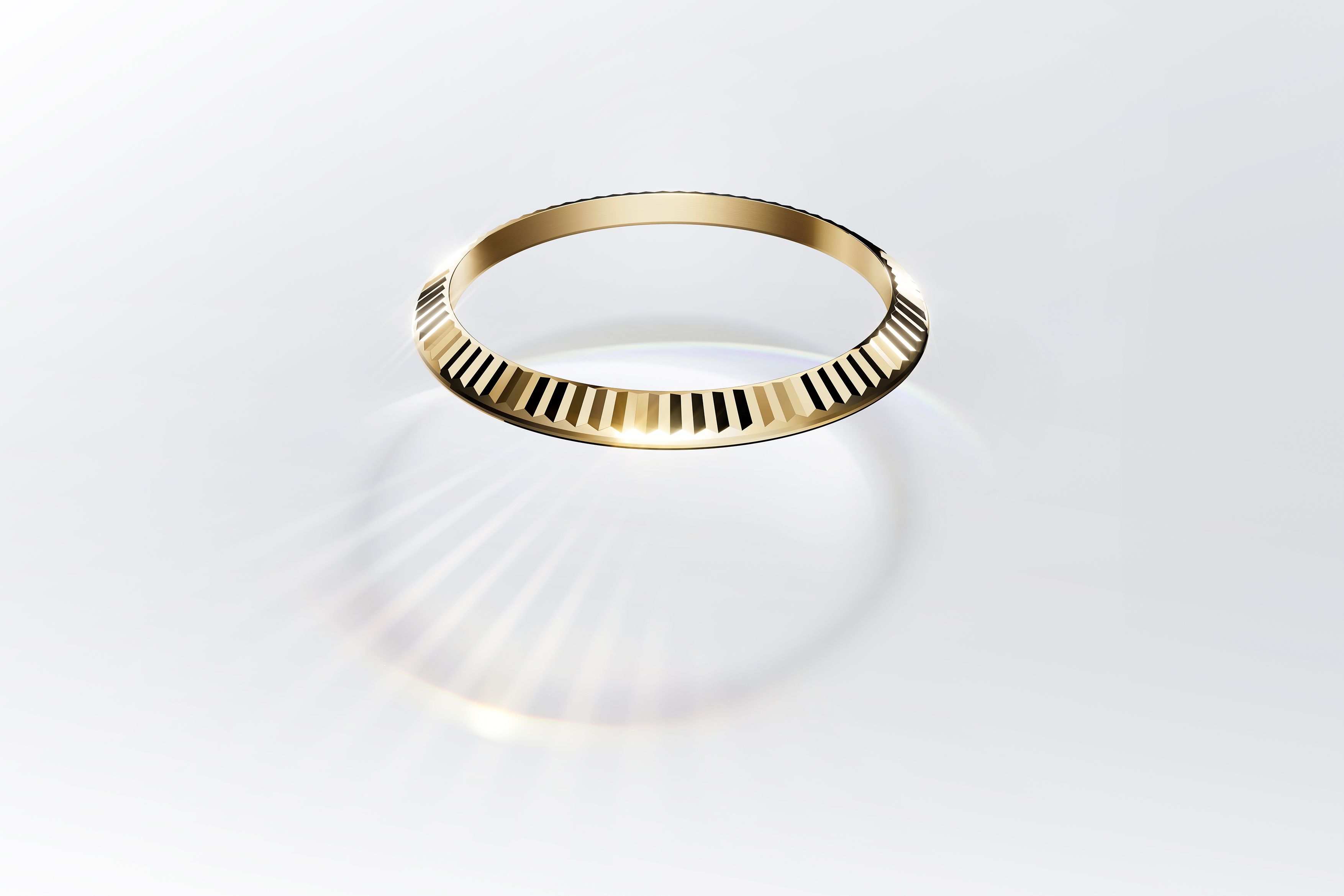
Originally designed to help screw the bezel onto the case to ensure waterproofness, the fluted bezel has since become a purely aesthetic signature. Crafted exclusively in gold or platinum, its precisely cut facets capture and reflect light with remarkable brilliance. Today, it stands as one of the defining features of Rolex’s Classic collection.
Chromalight: Blue in the Dark
Rolex’s commitment to legibility extends into darkness. Introduced in 2008, the Chromalight display emits a long-lasting blue glow, ensuring clarity in low-light environments whether underwater, underground or at night. The proprietary luminescent material offers stronger, more consistent brightness than traditional compounds, and was further enhanced in 2021 to extend glow duration while appearing brighter white in daylight. Gradually introduced across the Oyster Perpetual collection, Chromalight reflects Rolex’s broader philosophy: technical advancement that enhances both performance and identity. From bracelet architecture to bezel faceting, from magnified dates to luminous dials, Rolex has built its design language through engineering precision. Each element serves a function, yet together they create something more enduring a watch recognisable not by logo, but by silhouette and detail.

Why Simplicity Endures
In an age of increasingly complex watchmaking open-worked dials, multi-axis tourbillons, avant-garde materials it is often the simplest designs that prove most enduring. This is not a rejection of complexity, but a recognition that true iconography lies in clarity. A watch that can be recognised at a glance, remembered after a moment, and worn across generations has achieved something far greater than technical brilliance alone. It has achieved permanence.


